
The Blue Screen of Death (BSOD) has been a ubiquitous part of the Windows experience since the early 1990s. Its stark blue background, cryptic error messages, and abrupt appearance have become synonymous with system crashes, evoking a mix of frustration, fear, and dark humor among users. However, Microsoft is now retiring this iconic error screen in favor of a more modern, minimalist black screen in Windows 11. This shift marks the end of an era, but it also raises questions about the evolution of user experience, the symbolism of the BSOD, and what this change means for the future of Windows.
A Brief History of the Blue Screen of Death
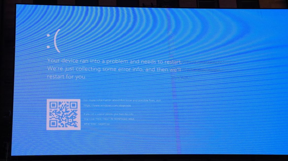
The BSOD first appeared in Windows 3.0 as a diagnostic tool, designed to alert users when the system encountered a critical error. Over the years, it evolved alongside Windows, incorporating hexadecimal codes, frown emojis, QR codes, and more user-friendly language. Despite these updates, its core function remained unchanged: to notify users that something had gone terribly wrong. For decades, the BSOD was a rite of passage for PC users, a moment of dread when unsaved work vanished, and the only solution was a reboot.
The BSOD’s design was a product of its time, reflecting the technological limitations and aesthetic preferences of the early 1990s. The bright blue background was chosen to stand out against the CRT monitors of the era, ensuring that users would immediately notice the error. However, as Windows matured, so did the expectations of its users. The BSOD’s stark blue hue, once a necessary warning, began to feel outdated and jarring in the context of modern design principles.
Why Microsoft Is Ditching Blue
The decision to replace the BSOD with a black screen is part of a broader effort to modernize Windows 11’s design language. The new operating system emphasizes clean lines, cohesive colors, and consistency across all screens. The BSOD’s bright blue background clashed with this aesthetic, standing out as a relic of a bygone era. By switching to a black screen, Microsoft aims to create a more cohesive and less alarming user experience.
The change is not merely cosmetic. The new error screen is designed to minimize stress, offering a simpler, more streamlined message. While crashes are still frustrating, the harsh shock factor is reduced. The black background is less visually disruptive, making it easier for users to focus on the error message and take appropriate action. Additionally, the new screen includes clearer language, a cleaner layout, and the retention of technical codes for diagnostics, ensuring that advanced users still have the information they need to troubleshoot effectively.
User Experience: More Than Just a Color Swap
For most users, the significance of this change goes beyond aesthetics. The bright blue background of the BSOD has become synonymous with emergency situations, triggering a visceral reaction of panic and frustration. By replacing it with a black screen, Microsoft aims to reduce the anxiety associated with system crashes. The new error screen is part of a broader effort to create a more cohesive and less intimidating user experience, reinforcing the idea that errors are a normal part of using a computer and can be resolved with minimal disruption.
The new black screen also aligns with other Windows 11 visuals, such as update screens, creating a sense of consistency and familiarity. This consistency is particularly important in enterprise environments, where users may encounter error messages frequently. A unified design helps to reinforce the idea that error messages are part of the operating system, rather than intrusions that disrupt the user experience.
For IT professionals and power users, the technical content of the error screen remains accessible. The familiar stop codes and error messages are preserved, now set against a more neutral palette. This ensures that advanced users can still diagnose and resolve issues effectively, while the streamlined design makes the information more accessible to less experienced users.
Symbolism and Sentimentality
The BSOD has become more than just an error message; it has evolved into a cultural icon. It has been the punchline of jokes, the star of memes, and a shared moment across generations of PC users. There is a peculiar nostalgia associated with the BSOD, much like the old dial-up modem sound or Microsoft’s Clippy. It represents a rite of passage for computer users, a shared experience that has become a part of technological folklore.
The color change itself is not the end of error messages or system failures. Windows will still crash, and users will still encounter critical stop errors. However, the rebranding signals a desire to escape the baggage associated with “blue screen” catastrophes. By replacing the bright blue background with a more neutral black, Microsoft aims to create a less alarming and more professional user experience.
How Will It Work Now?
When a crash occurs in Windows 11, users will now see a minimalist black background instead of the familiar blue screen. The error message will be more concise, explaining that the PC has encountered a problem. The stop code and, if relevant, the driver name will still be displayed, along with a QR code for easier troubleshooting. The overall design will align with Windows 11’s visual identity, featuring sleek fonts, modern icons, and a clean information layout.
This change is more than just window dressing. The black screen is less likely to startle or disrupt users, especially in dark environments. The streamlined design makes it easier for users to focus on the error message and take appropriate action. The QR code provides a quick and easy way to access troubleshooting resources, reducing the need for users to search for solutions manually.
Will the Blue Screen of Death Return?
This is not Microsoft’s first attempt to retire the blue screen. Previous versions of Windows 11 preview builds quietly swapped blue for black before reverting to blue due to user confusion during the pandemic era. However, the black version is now rolling out broadly and, according to Microsoft, will be the standard in future builds of Windows 11 and beyond.
Some legacy and embedded systems may continue to use the blue variant, and there is no shortage of unofficial apps that recreate the BSOD as a harmless prank. However, for the next generation of users, the infamous shine of blue has faded. The BSOD may still linger in the collective consciousness, but its days as a ubiquitous part of the Windows experience are numbered.
Implications for Daily Users and Businesses
For daily users, the end of the BSOD is not a technological revolution, but it reflects a broader philosophy of creating a smoother, less intimidating user experience. By aligning crash screens with other OS visuals, the event feels less catastrophic and more like a managed error. The streamlined design and clearer language make it easier for users to understand what has gone wrong and how to fix it.
For businesses, this update could mean fewer panicked support calls, as employees become accustomed to a gentler crash notification. The black screen is less likely to draw anxious attention, allowing users to focus on resolving the issue rather than being startled by a vivid blue screen. In enterprise environments, where system crashes can disrupt productivity, this change could have a significant impact on user satisfaction and efficiency.
Parting Thoughts: The Evolution of Error
The end of the BSOD does not mean that system crashes will disappear. Bugs will linger, hardware will fail, and drivers will cause trouble. No color swap can save users from a power cut mid-save. However, this change does close a chapter in the history of Windows. The BSOD’s departure is a sign of a maturing OS and a company in pursuit of a less intimidating, more harmonious user experience.
For every user who bids the blue screen good riddance, there is another raising a toast to an oddly comforting symbol of computer chaos. The BSOD may be gone, but its legacy lives on in the memes, jokes, and shared experiences of generations of PC users. As Windows continues to evolve, so too will the way users interact with and perceive system errors. The black screen may not have the same cultural impact as its blue predecessor, but it represents a step forward in the ongoing evolution of the Windows experience.